The Rise of Collector Books: Why Beautiful Physical Editions Are Booming in the Digital Age

The publishing industry spent years preparing for a future that didn't quite arrive.
Ebooks were supposed to win. The logic was clean: screens were everywhere, digital was cheaper, physical distribution was inefficient, and readers, especially younger ones, would eventually follow the same path as music and film. Print would survive in the margins, for the nostalgic and the stubborn.
What actually happened was stranger and, depending on your relationship with bookshelves, considerably more satisfying.
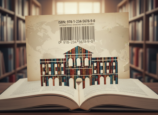
Physical books didn't just survive. They started getting more beautiful. Hardcovers with sprayed edges that look like someone dipped them in watercolour. Special editions with foil-stamped covers, illustrated endpapers, and ribbon markers in colours matched to the story's mood. Books that arrive in the mail and feel, immediately, like objects someone cared about making. These editions sell out in hours. Waiting lists form. Readers who own a perfectly readable paperback buy the special edition anyway, not to read it again but to own it differently.
What was once simply a format has become a collecting category.
Two things are driving this, and they're worth separating. The first is aesthetic and social - BookTok and Bookstagram have made bookshelves into visual spaces, where a spine or a stained edge can travel across the internet faster than any review. The second is something harder to name but increasingly difficult to ignore: as AI-generated text and imagery floods every digital surface, a handmade thing carries a different kind of weight. An illustrated edition with a cover designed by a specific artist, a print run that was considered rather than automated - these feel like a form of resistance, even when nobody's framing them that way.
The result is that books are becoming collectibles in the way vinyl records did; not because the content changed, but because the object started meaning something again.
For authors and publishers, this matters more than it might initially seem. A book that readers want to display, return to, and own in multiple forms is a different commercial and creative proposition than a book they read once and pass on. It's a longer relationship with an object, and designing for that relationship; thinking about what the book looks, feels, and even smells like is increasingly part of the job.
This piece is about how that shift happened, what's sustaining it, and what it means for anyone trying to make books people actually want to keep.

Books as Objects Again
For most of publishing history, physical design was essentially functional. The cover needed to work at a glance from three feet away on a bookstore shelf. The typography needed to be readable. The binding needed to survive being dropped in a bag repeatedly for two weeks. Nobody expected you to care about the book once you'd finished it.
That assumption has quietly collapsed.
Readers are now buying editions of books they've already read, in formats they don't strictly need, because the object itself has become part of the point. Sprayed edges that gradient from one colour to another. Foil-stamped covers that catch light differently depending on the angle. Illustrated endpapers that expand the world of the story before you've read the first page. Slipcases. Custom typography. Dust jackets designed by artists rather than marketing departments. These aren't afterthoughts, they're increasingly the reason someone chooses one edition over another, or buys a book they already own in a different form.
Subscription boxes like FairyLoot and Illumicrate built entire businesses on exactly this instinct. Each month, a special edition arrives: redesigned cover, exclusive artwork, custom packaging. And the editions sell out before most people have decided whether they want one. The resale market for these boxes tells you something about how seriously collectors take them: a box that retailed for forty pounds regularly appears secondhand for three times that.
Kickstarter has become the other major engine of this shift. Authors and small publishers launch campaigns for deluxe print runs: limited hardcovers, signed copies, illustrated interiors, collector packaging - and routinely find that readers will fund them enthusiastically before a single copy exists. What's being backed isn't just a story. It's the creation of a specific object, produced carefully and in limited numbers, that will feel different from anything you'd pull off a bookshop shelf.
What makes this interesting is that it isn't happening at the expense of digital. Ebook and audiobook consumption keeps growing. The formats aren't competing - they're diverging. Digital has become the format of convenience, speed, and portability. Physical is becoming the format of intention. You read the ebook on the train. You buy the special edition because you want to own the thing properly.
That divergence has a social dimension too; and social media, as we'll see, has had more to do with accelerating it than most publishers initially anticipated.
The BookTok Aesthetic Economy
A decade ago, book discovery was mostly invisible. You found something on a shelf, read a review, got a recommendation from someone whose taste you trusted. The book itself: what it looked like, how it felt in your hand - was largely beside the point.
That's not how it works anymore.
On BookTok and Bookstagram, books exist in two places simultaneously: on the page and on the screen. Readers film their shelves, stage their hauls, photograph their latest special edition against a background that matches the cover palette. A single video of someone cracking open a foil-stamped hardcover and fanning the pages to reveal stained edges can pull in millions of views and empty a print run within a week. The story might be what someone buys it for. The object is what makes them film it.
This has created something that didn't exist in publishing ten years ago: a visual economy around books, where physical design functions less like packaging and more like product. Publishers and authors who understand this aren't just asking "does this cover communicate the genre?" They're asking "does this cover make someone want to put it on their shelf and point a camera at it?" Those are different questions with different answers.
The genres where this is most visible, fantasy and romance especially, have developed entire subcultures around edition comparison. Not which version to read, but which version to own. Which print run has the better cover art. Whether the FairyLoot edition or the Illumicrate edition is rarer. Whether the Kickstarter hardcover is worth the premium over the trade paperback. Readers who are deeply invested in these questions aren't fringe collectors, they're a significant and vocal part of the market, and publishers have noticed.
What's happening is something the luxury goods industry figured out a long time ago: if your product is going to be photographed and shared at scale, its visual identity travels further than any campaign you could run. The difference is that books carry a story inside them, which means the aesthetic and the substance can reinforce each other in ways that a handbag or a sneaker can't quite manage.
But the BookTok economy is only part of what's driving the collector trend. There's something else underneath it, quieter, and in some ways more interesting that has less to do with social media and more to do with what's happening to creative work more broadly.
The AI Backlash and the Return of Human Craft
There's a timing here that isn't coincidental.
The same years that have seen AI expand into text generation, image creation, and cover design have also seen readers develop a sharper appetite for things that are visibly, provably made by hand. Whether that's cause and effect or just parallel currents is difficult to say with certainty. But the pattern is hard to ignore.
What's happening isn't quite a rejection of technology, it's more like a recalibration of what feels worth owning. Readers who consume most of their books digitally are increasingly willing to pay a premium for a physical edition that carries evidence of human decisions: an illustrator who made specific choices about how a character looks, a typographer who considered how the page should feel to read, a designer who matched the endpaper colour to something in the story's mood. These details don't change the words. They signal that someone cared about the object beyond its function as a text delivery system.
This is showing up in what collectors specifically seek out. Illustrated editions produced by named artists. Hand-lettered chapter headings. Cover artwork that could be framed. Page layouts that treat the white space as intentionally as the text. The common thread isn't nostalgia; it's authorship. Readers want to be able to point to the book and say a person made that, in the same way you can point to a ceramic bowl or a screenprint and understand that a specific human being was responsible for how it turned out.
The irony is that digital publishing has made this more powerful, not less. When text and images can be generated at scale in seconds, the books that couldn't have been made that way become more legible as a category. Scarcity used to be the default condition of physical objects. Now it's something that has to be demonstrated.
For authors, this represents a genuine shift in what the job can involve. Design and production quality were once the publisher's domain; something authors handed off and hoped for the best on. Increasingly, they're a creative and commercial consideration in their own right. A book that was clearly cared about as an object attracts a different kind of reader attention than one that wasn't, and that attention tends to be more durable, more shareable, and more likely to translate into the kind of word-of-mouth that no marketing budget reliably buys.
The more crowded the digital landscape gets, the more a beautiful physical book stands out in it. That's not a temporary trend. It's a structural advantage that's only likely to grow.
Why This Is Great News for Authors
For most of publishing history, the economics of a physical book were fairly fixed. A paperback had a price point. That price point had a ceiling. The only way to meaningfully increase revenue was to sell more copies, which meant competing for shelf space, review attention, and distribution reach that most independent authors couldn't reliably access.
Collector editions change the underlying logic of that equation.
A hardcover with sprayed edges, illustrated endpapers, and a foil-stamped cover isn't competing on the same terms as a standard paperback. It's a different category of object, and readers treat it accordingly. Prices that would seem absurd for a standard edition: forty, sixty, eighty dollars, become reasonable when the book is also something you'd display, gift, or hold onto for twenty years. The story is the same. What's changed is what surrounds it, and that changes what it's worth to the person buying it.
This opens up something that other creative industries have understood for a while. Musicians release vinyl alongside streaming. Film studios produce collector box sets for catalogues that are already available everywhere for free. The digital version handles access. The physical version handles ownership. They serve different needs, which means they can coexist without one cannibalising the other.
Books are arriving at the same model, and for independent authors specifically, the timing is good. Kickstarter and similar platforms have made it possible to fund a premium print run without a publisher, a distributor, or a substantial upfront investment. You propose the object, readers decide whether they want it to exist, and the campaign funds the production before a single copy is printed. The risk profile is entirely different from a traditional print run, and the relationship it creates with readers - backing something into existence rather than simply buying it off a shelf - tends to be more durable.
The authors doing this well aren't treating the collector edition as a separate project from the book. They're thinking about the physical object as an extension of the reading experience - what the endpapers should feel like given the story's world, what an illustrator who understood the characters might do with a full-page spread, what the cover should communicate to someone who's never heard of the book but recognises immediately that it was made with care.
That's a different kind of creative consideration than most authors have historically needed to have. But it's increasingly part of what separates a book people read from a book people keep.
The Risk: Design Without Substance
Any trend that starts generating real money attracts people who are interested in the money more than the trend. Collector publishing is no exception, and it's worth being clear-eyed about what that looks like in practice.
As premium design has become a legitimate commercial strategy, a portion of the market has responded by treating it as a shortcut. Books with beautiful covers and meticulously sprayed edges that turn out, on the inside, to be thin. Stories that don't justify the object that surrounds them. The design as the pitch rather than the extension. Reader communities, which are observant, vocal, and have long memories have a name for this: pretty but empty. It's not a compliment, and it travels.
The problem isn't aesthetic ambition. It's ambition that substitutes for substance rather than serving it. A foil-stamped cover on a genuinely compelling novel amplifies something real. The same cover on a book that doesn't earn it just makes the disappointment more expensive.
There's a related risk in the language around scarcity. "Limited edition" works as a signal when it means something - a genuine constraint on the print run, a production decision that makes the object harder to replicate at scale. When every book is a limited edition, none of them are. The term becomes wallpaper, and readers who've been burned by it once tend to become considerably more sceptical the second time.
What the most successful collector editions have in common isn't the quality of their sprayed edges; it's that the physical object and the story inside it feel like they were designed for each other. The illustrated endpapers expand the world rather than decorate it. The cover captures something true about the book rather than something generically appealing about the genre. The weight and texture of the thing in your hands feels appropriate to what you're about to read.
That coherence is difficult to fake and impossible to manufacture in post-production. It has to be considered from the beginning, which means authors who want to work in this space need to think about the physical object at the same time they're thinking about the manuscript - not as an afterthought once the writing is done.
Design can make a great book more visible. It cannot make a mediocre book worth keeping. That distinction is obvious in retrospect and easy to forget in the middle of a trend.
PubliWrite and the Case for Books Worth Keeping
Independent authors have spent the last decade being told, with reasonable justification, to think digitally. Publish fast, distribute wide, optimize for discoverability, keep the catalogue moving. For certain genres and certain goals, that advice still holds. But it was never the complete picture, and the collector trend has made the gap more visible.
The part that got left out was the object itself.
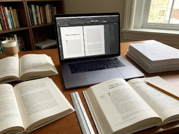
Most digital-first publishing workflows aren't built with physical craft in mind. Formatting decisions that work fine for an ebook create problems in a premium print layout. Cover design optimized for a thumbnail doesn't necessarily translate to something that looks considered at full size in someone's hands. Metadata structures built around a single edition become awkward when the same book exists in three formats with different features, different prices, and different audiences. The tools shaped the habits, and the habits shaped what authors thought was possible.
At PubliWrite, what we're trying to build is a workflow that holds both sides of this without forcing a choice between them. The efficiency that digital publishing genuinely offers: formatting, distribution, metadata, the mechanical work that shouldn't require weeks - alongside the production quality that makes a physical edition worth owning. Professional print layouts that treat the page as a design space rather than a text container. Cover tools built around visual impact rather than template adequacy. Edition structures that let an author manage a paperback, an ebook, and a deluxe hardcover as versions of the same project rather than separate administrative headaches.
The underlying belief is straightforward: readers are showing, with their money and their attention, that they value books as objects - not instead of valuing them as stories, but alongside it. Authors who can meet that on both fronts are in a stronger position than authors who can only meet it on one. The tools should reflect that.
A book readers don't just finish but keep, display, return to, and press into the hands of people they want to share it with - that's a different kind of success than a book that moves units and disappears. We think it's worth building toward, and we think more authors can get there than the current infrastructure tends to suggest.
Final Thoughts — The Return of the Book as an Object
The prediction was wrong, and it was wrong in an interesting direction.
Digital wasn't supposed to leave room for this. The logic of convenience - cheaper, faster, always accessible, infinitely portable - should have squeezed out the expensive, heavy, shelf-dependent alternative. That's how it went with music, more or less. That's how it went with film. Books were supposed to follow.
Instead, they went somewhere else.
Ebooks and audiobooks kept growing because the convenience argument is real and the accessibility benefits are genuine. But physical books stopped competing on those terms and started competing on entirely different ones. Weight. Texture. The specific colour of sprayed edges against a particular cover. The feeling of opening something that was clearly made to be opened. These aren't things that can be streamed or compressed or delivered to a device. They require an object, and the object has to be worth having.
What the collector trend is really telling us is that readers have always wanted both things: the story and the experience of the story. And that, for a long time, publishing gave them only one of them by default. The formats that serve convenience are mature and efficient. The formats that serve ownership and permanence are just beginning to be taken seriously as a design space.
For authors, that's an opening. Not every book needs a foil-stamped hardcover and a Kickstarter campaign. But every author who's thinking seriously about their work is now asking a question that didn't feel relevant ten years ago: what should this book be like as an object? What does it feel like to own it, not just to read it?
Those questions don't have easy answers. But the fact that readers are asking them too, with their attention, their money, and their very full bookshelves - suggests they're worth sitting with.
The future of publishing is probably digital in most of the ways that matter for access and scale. But the books that end up meaning something, the ones that get kept and passed on and pulled off shelves years later for no particular reason, will almost certainly be the ones that were made to last.
Are you buying books differently than you were five years ago - and if so, what changed?
We're curious whether the collector trend has reached your shelves, or whether you think the whole thing is a bit much.
Before you go:️️
- Follow us: X | LinkedIn | Instagram | Meta
- Visit our website at https://publiwrite.com