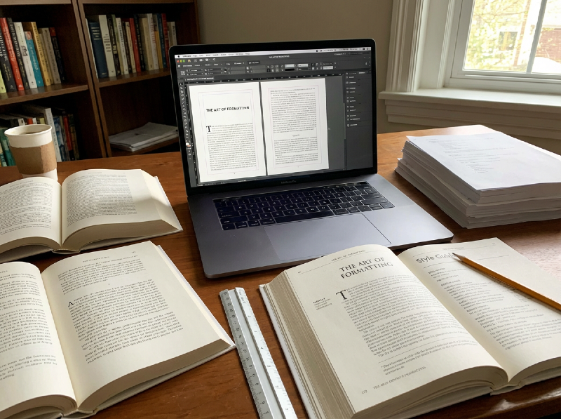
How to Format Your Book Like a Professional: Tools, Formats, and Best Practices in 2026
Formatting is one of the most underestimated steps in publishing until it goes wrong.
You can have a brilliant story, a polished manuscript, and a stunning cover, yet still lose readers within the first few pages because the book simply feels off. Awkward spacing, broken paragraphs, inconsistent headings, unreadable fonts; all these details quietly signal "unprofessional" long before a reader gets to the story itself.
For many authors, formatting is confusing territory. Should you format for ebook first or print? Is Word good enough? Do you need specialist software? And now that AI tools promise "one-click" book formatting, are they actually helpful or just another way to break things you don’t fully understand?
The truth is, formatting isn’t about making your book look fancy. It’s about readability, accessibility, and trust. It’s the invisible layer that ensures your story flows smoothly across devices, print sizes, and reader preferences and it plays a bigger role in reviews, returns, and discoverability than most authors realise.
In this article, we’ll break down how book formatting really works. We’ll look at the different formats your book may need, the tools available today, best practices used by professionals, and where AI can genuinely help and where it can quietly cause problems. Whether you’re publishing your first book or refining your process, this guide will help you format with confidence instead of guesswork.
Why Formatting Matters More Than You Think
Most readers won’t consciously notice good formatting but they’ll immediately feel bad formatting.
The moment a reader opens your book, they form an impression. If paragraphs are awkwardly spaced, chapter breaks feel inconsistent, or text doesn’t adapt properly to their device, trust erodes fast. It doesn’t matter how strong the story is, poor formatting creates friction, and friction pushes readers away.
This is especially true for ebooks. Unlike print, ebooks must adapt to different screen sizes, fonts, and reader preferences. A file that looks fine on your laptop can break entirely on an e-reader or mobile device. Fixed fonts, manual spacing, or hard-coded layouts can lead to cramped pages, missing breaks, or unreadable text; all things readers will blame on the author, not the technology.
Formatting also plays a direct role in reviews and returns. Many one-star reviews don’t mention plot or prose at all; they mention "hard to read", "weird spacing", or "looks unprofessional". Retailers may quietly suppress poorly formatted books, and libraries or bookstores may refuse to stock titles that don’t meet technical standards. In other words, formatting doesn’t just affect aesthetics, it affects distribution and discoverability.
There’s also the issue of accessibility. Clean structure, proper headings, re-flowable text, and logical navigation aren’t just best practices; they’re essential for readers who rely on screen readers or adjustable text settings. Formatting mistakes can unintentionally exclude part of your audience.
Perhaps, most importantly, formatting is a credibility signal. Readers may not know why a book feels professional, but they know when it does. Consistent layout, clear chapter structure, and smooth navigation tell the reader that the author took care and that care extends to the story itself.
The challenge is that formatting sits at the intersection of writing and technology. It’s rarely taught, often misunderstood, and heavily dependent on the tools authors use. That’s why the choice of format and software matters far more than most writers expect and why the next step is understanding what you’re formatting for in the first place.
Choosing the Right Format for Your Book
One of the biggest mistakes authors make with formatting is assuming there’s a single "final" version of their book. In reality, formatting starts with a more fundamental question: what formats does this book need to exist in?
Each format comes with its own rules, reader expectations, and technical constraints. Choosing the right one and choosing the order in which you tackle them can save time, money, and frustration later on.
Ebook Formatting (EPUB, Kindle formats)
For most indie authors, ebooks are the natural starting point. They’re faster to produce, cheaper to distribute, and far more forgiving than print.
Ebooks are designed to be re-flowable, meaning the text adapts to different screen sizes, fonts, and reader settings. Because of this, good ebook formatting prioritises structure over appearance. Clean headings, proper paragraph styles, and logical navigation matter far more than fixed layout or visual precision.
Ebooks work particularly well for:
- Fiction
- Narrative nonfiction
- Series and novellas
- First-time authors testing the market
They are less suitable for heavily designed books, such as textbooks, art books, or children’s picture books, where layout is part of the reading experience.
Print Formatting (Paperback and Hardcover)
Print books are less flexible but far less forgiving.
Once a book is printed, everything is fixed: margins, fonts, page numbers, chapter spacing. Small mistakes that go unnoticed in digital files become obvious and expensive in print.
Print formatting requires careful attention to:
- Trim size and margins
- Page count (which affects cost)
- Typography and spacing
- Consistent chapter openings
- Print-safe fonts and images
Print works best when the content is stable. Formatting for print before editing is finished almost guarantees rework. This is why many professionals recommend finalising the manuscript first, then formatting for print as a separate step.
Hardcover Considerations
Hardcovers add another layer of complexity. They often require different margins, spine calculations, and cover specifications compared to paperbacks. While the interior text may remain largely the same, the production details change — and mistakes are harder to fix once files are submitted.
Hardcovers make sense for:
- Established authors
- Nonfiction with perceived long-term value
- Gift-oriented books
But they demand precision, which is why the formatting workflow matters even more.
Audiobook Implications (Often Overlooked)
While audiobooks don’t involve visual formatting, the way your manuscript is structured still matters. Clean chapter breaks, consistent headings, and well-marked sections make narration smoother and reduce production costs.
Formatting with audio in mind early on can prevent confusion later especially if you plan to expand into multiple formats.
One Book, Multiple Formats - One Strategy
The key takeaway is this: formatting isn’t a single decision. It’s a strategy.
Many authors benefit from starting with an ebook-friendly structure, then adapting it for print and other formats once the content is final. Others may prioritise print first, depending on genre and audience expectations.
There’s no universally correct path but there is a costly one: treating formatting as an afterthought.
Common Formatting Mistakes Authors Make
Most formatting problems don’t come from lack of effort. They come from misunderstanding how books actually work across formats and devices. Many of these mistakes are incredibly common, even among experienced authors.
1. Formatting visually instead of structurally
One of the biggest mistakes is formatting by eye. Authors manually add spaces, extra line breaks, or tabs to make pages "look right". While this may appear fine in Word or Google Docs, it often breaks completely in ebooks and causes inconsistent spacing in print.
Professional formatting relies on styles, not manual adjustments. Headings, paragraphs, quotes, and scene breaks should all be defined structurally so they adapt correctly across formats.
2. Treating Word as a finished book file
Word is a writing tool, not a publishing format. Many authors assume that if a document looks good in Word, it’s ready to upload. In reality, Word files often contain hidden formatting, inconsistent styles, and layout issues that only appear once converted to EPUB or print PDFs.
This is one of the most common reasons ebooks display incorrectly on different devices.
3. Ignoring ebook reflow rules
Ebooks are designed to adapt to reader preferences. Fixed fonts, forced line spacing, and rigid layouts fight against that system. Readers want control over font size, margins, and spacing and when a book prevents that, frustration follows quickly.
Good ebook formatting is flexible by design. If your ebook looks "too perfect", it’s often a warning sign.
4. Formatting before editing is finished
Formatting too early almost guarantees rework. Each round of editing can shift paragraphs, change chapter lengths, and introduce new layout problems. Professional workflows always separate content creation from layout.
Formatting should come after the manuscript is stable — not while it’s still changing.
5. Overlooking print-specific details
Print books have rules ebooks don’t:
- margin balance
- trim sizes
- page count implications for cost
- font licensing for print
Skipping these details can lead to awkward page breaks, inflated printing costs, or rejected files.
6. Forgetting accessibility
Formatting isn’t just about looks; it’s about access. Missing heading hierarchy, poor navigation, or unreadable text can exclude readers who rely on assistive technologies. Accessibility-friendly formatting benefits everyone, not just a small subset of readers.
7. Assuming tools will "just fix it"
Modern tools, including AI-powered ones, can help tremendously. However, they’re not magic. When authors feed poorly structured manuscripts into formatting tools, the output reflects those flaws. Tools amplify structure; they don’t create it from nothing.
Most formatting mistakes stem from one core issue: trying to solve a structural problem with visual tweaks.
Once that distinction is clear, the choice of tools and how to use them becomes far more straightforward. The next question becomes practical: what tools can actually help you get there without breaking everything along the way?
Formatting Tools: What’s Out There Today
Once authors understand why formatting matters and what they’re formatting for, the next question is inevitable: which tools actually help and which ones create more problems than they solve?
There’s no single "best" formatting tool. The right choice depends on your format, budget, technical comfort, and long-term publishing goals. Below is a realistic overview of the most commonly used options today.
Writing Tools (Good for manuscripts, limited for final formatting)
Microsoft Word / Google Docs
These tools are excellent for writing and collaboration, but limited for final publishing.
Best for:
- Drafting and editing
- Working with editors and beta readers
Limitations:
- Hidden formatting issues
- Poor EPUB control
- Not designed for print-ready layout
Word is often where formatting problems begin — not where they usually end.
Dedicated Formatting & Publishing Tools
- Vellum — Mac, fiction/nonfiction, ebook + print, low learning curve, one-time
- Atticus — Cross-platform, ebook + print, low-medium learning curve, subscription
- Scrivener — Long-form writing, ebook + print, medium-high learning curve, one-time
- Reedsy Book Editor — Clean ebooks, limited print, low learning curve, free
- InDesign — Complex layouts, limited ebook, high learning curve, subscription
- Kindle Create — Amazon-only ebooks, no print, low learning curve, free
- PubliWrite — Clean ebook + print, low learning curve, free
Notes:
- Dedicated tools work best when the manuscript is already clean and structured
- InDesign is powerful but often excessive for standard novels
AI-Assisted Formatting Tools
AI has recently entered the formatting space — and while it’s promising, it’s not without trade-offs.
Where AI helps:
- Cleaning heading structure
- Identifying inconsistencies
- Converting manuscripts into basic structured formats
- Speeding up repetitive tasks
Where AI struggles:
- Complex print layouts
- Poetry, children’s books, tables, or diagrams
- Accessibility compliance
- Retailer-specific formatting rules
AI works best as an assistant, not a replacement. When paired with strong structure and human oversight, it can significantly reduce workload. When used blindly, it can quietly introduce errors that only surface after publication.
Choosing the Right Tool Comes Down to Three Questions
Before committing to any tool, authors should ask:
- Which formats am I publishing first? (ebook, print, both)
- How technical do I want this process to be?
- Do I need repeatability for future books or series?
Tools don’t fix bad formatting decisions; they reinforce good ones. The goal isn’t to chase the most powerful software, but to choose the one that supports your workflow without adding friction.
AI in Book Formatting - Helpful or Risky?

AI has started creeping into every part of publishing and formatting is no exception. New tools promise faster conversion, cleaner layouts, automatic structure, and "one-click" exports that supposedly remove the need for technical knowledge.
And to be fair: AI can help.
But formatting is one of those areas where "mostly correct" isn’t good enough. A formatting error doesn’t always look dramatic; it can be subtle, inconsistent, and only visible on certain devices or in print proofs. That’s why AI in formatting is best approached as assistance, not automation.
Where AI Can Be Genuinely Useful
Structure and consistency checks
AI is surprisingly good at spotting inconsistencies humans miss:
- inconsistent heading levels
- repeated spacing patterns
- chapter formatting differences
- paragraph indentation and alignment issues
- inconsistent scene breaks or separators
This is valuable because most formatting problems begin as structure problems, not software problems.
Converting messy manuscripts into cleaner layouts
If a manuscript has been edited across multiple Word versions, copy-pasted from emails, or stitched together over time, it often contains hidden formatting "debris". AI-assisted cleanup can help normalise paragraphs, headings, and spacing so your formatting tool has cleaner inputs.
"Style guide" type assistance
AI can help you enforce formatting best practices such as:
- consistent chapter title style
- consistent use of italics and em dashes
- consistent block quote formatting
- consistent front matter and back matter structure
Think of this as AI acting like a detail-oriented assistant, not as the formatter itself.
Speeding up repetitive tasks
If your workflow includes things like:
- generating a consistent table of contents structure
- formatting endnotes or references
- creating consistent section dividers
- preparing multiple versions (e.g., ebook + print)
AI can reduce time spent on repetitive clean-up and preparation.
Where AI Formatting Often Goes Wrong
This is where authors should be careful. The risk isn’t "AI makes everything terrible". The risk is AI produces outputs that look fine until they don’t.
Ebooks are not "designed pages"; they’re re-flowable systems
AI tools often try to make the ebook look good in one view but ebooks must adapt to:
- different fonts
- different screen sizes
- reader settings
- different ebook apps
Anything overly "fixed" can break the reading experience quickly.
Print formatting requires precision
Print files must handle:
- margins and trim sizes
- page numbering
- consistent chapter openings
- image resolution and bleed (if applicable)
AI can assist, but it can’t reliably guarantee print precision without human review. A single inconsistency becomes very visible once the book is physically printed.
Complex books break AI workflows
AI struggles most with:
- poetry
- children’s picture books
- textbooks and workbooks
- tables, charts, footnotes
- heavily illustrated nonfiction
These formats require layout decisions, not just clean structure.
Accessibility and compliance are easy to miss
Even if a layout looks correct, AI may generate:
- broken heading hierarchy
- weak navigation structure
- inconsistent semantic tagging
- poor screen-reader compatibility
That can impact accessibility and discoverability — and it’s rarely obvious unless tested properly.
The Best Way to Use AI in Formatting
The safest and most effective approach is:
- Use AI to prepare your manuscript
- Use tools to format it
- Use previews/proofs to validate it
In other words, AI can be powerful in the early pipeline — cleaning, structuring, and helping you catch mistakes but it shouldn’t be the final authority.
AI works best as a formatter’s assistant, not as the formatter itself.
And if you choose to use AI, the golden rule is simple:
Always preview on multiple devices for ebooks, and always order a print proof for print.
If you can’t validate it, you can’t trust it.
Formatting Best Practices Every Author Should Follow

No matter which tools you use, good formatting follows the same core principles. These aren’t stylistic preferences; they’re the standards that make a book readable, professional, and trustworthy to readers and retailers alike.
1. Start With a Clean Manuscript
Most formatting problems don’t begin in formatting software; they begin in the manuscript.
Before importing anything:
- Use one font throughout the draft
- Remove manual spacing and tabs
- Use real paragraph styles instead of visual hacks
- Avoid hitting "Enter" repeatedly to force layout
A clean manuscript gives every tool, whether it is human or AI, a fair chance to produce good output.
2. Use Styles, Not Manual Formatting
Never format by eye.
Instead:
- Use paragraph styles for body text, headings, quotes
- Use consistent scene break markers
- Let your tool control spacing, indentation, and alignment
Manual formatting almost always breaks when exported to ebook formats or converted between tools.
3. Respect Ebook and Print Differences
Ebooks and print books are fundamentally different products.
For ebooks:
- Avoid fixed layouts unless absolutely necessary
- Don’t force line breaks or spacing
- Let text reflow naturally
- Test on multiple screen sizes and apps
For print:
- Check margins and trim size carefully
- Watch for widows and orphans
- Ensure page numbers and chapter openings are consistent
- Always order a physical proof
Formatting that works perfectly for one format can fail completely in the other.
4. Pay Attention to Front Matter and Back Matter
These sections are often overlooked and frequently wrong.
Make sure you include (where appropriate):
- Title page
- Copyright page
- Table of contents (linked for ebooks)
- Dedication / acknowledgements
- About the author
- Calls to action (newsletter, next book, etc.)
And make sure they appear in the correct order for your chosen format.
5. Test Like a Reader, Not Like an Author
Once formatted, step back.
Ask yourself:
- Is the text comfortable to read for long sessions?
- Are chapter breaks clear and consistent?
- Does navigation feel intuitive?
- Does anything feel "off", even if you can’t name it?
If something pulls you out of the reading experience, it will do the same to your readers.
6. Validate Across Devices and Platforms
Never rely on a single preview.
For ebooks:
- Preview in multiple apps (Kindle, Apple Books, Kobo)
- Check both light and dark mode
- Increase font size to test reflow
For print:
- Review digital proofs carefully
- Order at least one physical copy
- Check spine alignment, margins, and pagination
What looks fine in one environment can fail in another.
7. Don’t Over-Design
Professional formatting is often invisible.
Avoid:
- too many fonts
- decorative elements that don’t serve readability
- excessive styling in body text
- visual tricks that look good once but age badly
The goal isn’t to impress; it’s to disappear behind the story.
8. Treat Formatting as Part of Publishing, Not a Final Chore
Formatting isn’t something you "get through".
It’s part of how your book communicates professionalism, care, and credibility.
Readers may not consciously notice good formatting, but they always notice bad formatting.
The Big Takeaway
The best formatting is:
- consistent
- readable
- invisible
- tested
- respectful of the reader
Tools change. AI evolves. Platforms come and go.
But these principles stay the same.
PubliWrite’s Perspective: Making Formatting Simple, Not Stressful
At PubliWrite, we’ve seen the same pattern again and again: authors don’t struggle because they lack talent; they struggle because the technical side of publishing steals time and energy from writing.
Formatting is one of the biggest friction points in that journey. It’s essential, highly visible to readers, and often underestimated until something goes wrong.
That’s why PubliWrite approaches formatting as part of the publishing workflow, not a separate technical hurdle. Our tools are built to help authors create clean, professional ebooks and print-ready files without needing design experience or manual layout work.
With PubliWrite:
- Formatting is guided and structured, reducing the risk of hidden errors
- Ebook and print outputs are handled in parallel, not as afterthoughts
- Metadata, structure, and layout work together instead of living in separate tools
- Authors can focus on content while the system handles consistency and standards
We don’t believe formatting should require expensive software, steep learning curves, or trial-and-error exports. It should be predictable, transparent, and aligned with how books are actually read and distributed today.
AI has a role to play, especially in helping authors prepare cleaner manuscripts and catch inconsistencies early. But the final responsibility still belongs to systems designed specifically for publishing, not generic document tools.
Our goal isn’t to replace creativity with automation. It’s to remove unnecessary complexity so authors can publish with confidence knowing their book will look right, read well, and work everywhere it’s sold.
Final Thoughts: Formatting Is Part of the Reading Experience
Formatting isn’t just a technical step between writing and publishing; it’s part of how your story is experienced.
A well-formatted book:
- respects the reader’s time and attention
- feels professional and trustworthy
- disappears behind the story instead of interrupting it
The good news is that authors today have more options than ever. Powerful tools, clearer standards, and thoughtful use of AI mean formatting no longer has to be intimidating. But it still requires care, testing, and intentional choices.
Regardless of the platform you choose to use, the principle is the same:
Formatting works best when it supports the story, not when it competes with it.
Take the time to get it right. Your readers may never notice why your book feels good to read but they’ll notice if it doesn’t.
👉 How about you? Which part of formatting do you find the most challenging — ebooks, print, tools, or consistency?
👉 Share your thoughts and experience in the comments and let's compare notes
Before you go:️️
- Follow us: X | LinkedIn | Instagram | Meta
- Visit our website at https://publiwrite.com